Kind Words from Terry Laundry, Founder of T Theory

"Parker has sent me what I consider to be the most important refinements to T Theory I have ever received from anyone in an e-mail . . . which he calls Tweaking the 13th Advance Decline T." September 29, 2010

"Parker has sent me a very interesting concept which is the NY Advance Decline line divided by the put-call ratio . . . What he's done is introduce the idea of sentiment." September 15, 2010

"Parker discovered the Money Flow Ts . . . This is something like the Holy Grail in T Theory. You are always looking for something that will help you refine the peak date." October 17, 201

"Money Flow Ts are probably the greatest new thing I have seen in 20 years in terms of time symmetries."
December 5, 2010.

Wednesday, July 28, 2010

$SPX - Gann Inflection Points

The next Gann inflection point on the S&P is 1144.25 +/- 1.5 points.  I derived this from my personal Gann Square of 9 calculator.  Should the S&P experience significant resistance at this level, I will likely initiate a short trade. 


On the Dow, the next Gann inflection point is 10,732.50 +/- 15 points.  For the NASDAQ composite, the next Gann inflection point is 2353 +/- 4.5 points. 

Note, should price break through these inflection points with little resistance, then these inflection points can serve as support levels on any subsequent correction, and can be excellent long entry points if they do provide support.

Friday, June 11, 2010

$$ Martin Armstrong's Economic Confidence Cycle

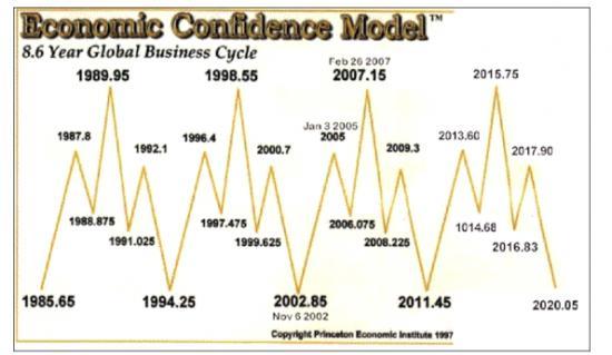
On Monday, June 13, 2011 (2011.45), one year from tomorrow, Martin Armstrong's economic confidence model predicts an 8.6 year cycle low in economic confidence:


If Armstrong is right, in all likelihood risk appetite will be very low a year from now, and safe haven assets will experience a peak.

Note that Terry Laundry's Confidence Index experienced an important low in 2002, and an important high in 2007.  Not exactly the same dates that Martin Armstrong projected in 2002 and 2007, but close.

Note also that the Aden Sisters 8 & 11 year gold cycle chart projects an 11 year cycle high in gold in ~2011-12, an 8 year cycle low in ~2015-16, and another 11 year cycle high in ~2019-2020.  These dates generally line up with Armstrong's calls for tops and bottoms in economic confidence over the next decade.

Friday, June 4, 2010

$GLD - Potential Cup and Handle Formation

There is a potential cup & handle pattern forming in gold.  William O'Neil discovered the pattern.  Some of the things he looks for in cup & handle patterns are:

1.  Share price rise leading into left lip at least 30%.  Here the rise was 34% from July 2009 to December 2009.

2.  Cup duration usually between 13 and 26 weeks.  This cup formed over 22 weeks.

3.  Cup depth between 12-33%.  The depth here is 18%.

4.  Declining volume in the handle.  Check.

5.  The handle forms in the upper half of the cup above the 200-day moving average.  Check.


6.  Handle duration best if completes within 4-5 weeks.  So far so good.

In addition, I like to see U-shaped volume in the cup formation, which we have here.

The pattern is confirmed when price closes above the right lip of the cup on a significant volume breakout.  If the pattern completes, the conservative target is half the depth of the cup above the right lip, or $1345. Many times, price will exceed full cup depth added to the right lip, or $1445 in this case. 


We are nearing a low risk entry point for gold.  Gold closed down today at $1206.80.  Should it fall back into the $1185 region over the next week or so, you could enter long with a stop at $1130 (50% of the cup depth).  You'd be risking $55 for a potential gain of $160 to $260.

Monday, May 31, 2010

$SPY - Head & Shoulders Pattern Forming?

As indicated in the chart below, the put-call ratio is overly bearish which sets up nicely for a rally in the S&P.  In addition, several other indicators show that we might be due for a rally.


If we get a rally over the next several weeks, I'll be watching how the S&P interacts with the 1150-1170 levels of former support and resistance, as well as the 50-day moving average (currently at 1163).  Should the S&P fail to break through these levels and start to retreat, it will form the right shoulder of a head and shoulders topping pattern, which would be immensely bearish.

If it forms, this right shoulder should complete well ahead of Terry Laundry's August 26 projected top date.

Wednesday, May 19, 2010

$$ Huge Spike in the Put/Call Ratio

The combined equity-index put/call ratio spiked to over 4:1 at the open.  Readings over 1:1 are considered extreme fear.  Looking at long-only day trading set ups today.

Monday, May 17, 2010

$SLV Put-Call Ratio Update

Last Wednesday, I wrote about about the Put-Call ratio in SLV reaching a one-year low.  I mentioned you might want to start planning your exit strategy if you were long.  The next day, silver hit a yearly high of $19.80 an ounce on Thursday, May 13. 

This morning, silver is now trading at less than $18.80 an ounce, a fall of more than $1.00 an ounce since last Thursday:


Why does this happen?  Once you get full participation on the bull side, there's a ton of sell stop orders sitting beneath the market price.  Many of them are market orders.  Once they start to get triggered, it can become a cascade of selling action.

$$ Fed Funds Target Rate & AAII Stock Screens

Every few years, the Federal Reserve changes direction on its Fed Funds target rate.  I classify a change of direction as a 50 basis point move.  It usually happens over two 25 basis point moves, but occasionally the Fed will move 50 basis points all at once.  Here's the history over the last ~15 years:

December 19, 1995:  Target rate coming down. 
August 24, 1999:  Target rate going up. 
January 31, 2001:  Target rate coming down. 
August 10, 2004:  Target rate going up. 
September 18, 2007:  Target rate coming down. 

The American Association of Individual Investors (AAII) has tracked the performance of a variety of stock screens since 1998.  Theorizing that some companies and therefore AAII screens do better in times of cheap money, while other companies/AAII screens outperform in times of money tightening, I wondered whether the change of direction in the Fed Funds target rate could be a useful signal in choosing between the AAII stock screens over the last 13 years.  

AAII member Todd (screen name "tschoepflin") came to the rescue.  What he found was quite remarkable:  using the Piotroski 9 screen during periods when the Fed Funds target rate was coming down, and switching to the Kirkpatrick Value screen once the Fed Funds target rate started to climb produced annualized compound returns in excess of 48% from 1998-2009!  And you'd be up another 158% from January 1, 2010 through April 30 2010! 

Switching between Piotroski 9 and Kirkpatrick Value significantly outperformed sticking to one screen or the other exclusively.  From 1998-2009, Piotroski 9 returned ~28% a year (one of the top 4 performing screens), while Kirkpatrick Value returned ~19% per annum.  Further, during periods of money tightening, Piotroski 9 returned only 15.7% cumulative from September 1, 1999 - January 31, 2001, and lost money between September 1, 2004 and September 30, 2007.  During periods of money easing, Kirkpatrick Value essentially broke even between February 1, 2001 and August 31, 2004, and has lost money since October 1, 2007.

This performance was measured using AAII's methodology, which is a monthly re-balancing model with 100% re-invested in all passing companies each month.  If only one company passed the screen, you'd be 100% allocated in that one stock for the month.  If no companies passed the screen, you'd sit the month out.  No stop loss orders are used.   

To use the Fed Funds target rate change of direction as a signal, you would simply switch screens the month after a Fed Funds target rate change of direction.  Here's the yearly performance breakdown, with the S&P cited for comparison:

1998
Piotroski 9:  17.9%
S&P:   26.7%

1999
Piotroski 9/KV:  26.6%
S&P:  19.5%

2000
Kirkpatrick Value:  63.9%
S&P:  (10.1%)

2001
KV/Piotroski 9:  48.3%
S&P:  (13.0%)

2002
Piotroski 9:  (15.9%)
S&P:  (23.4%)

2003
Piotroski 9:  154.6%
S&P:  26.4%


2004
Piotroski 9/KV:  91.3%
S&P:  9.0%

2005
Kirkpatrick Value:  88.2%
S&P:  3.0%

2006
Kirkpatrick Value:  18.5%
S&P:  13.6%

2007
KV/Piotroski 9:  44.2%
S&P:  3.5%

2008
Piotroski 9:  32.6%
S&P:  (38.5%)

2009
Piotroski 9:  78.3%
S&P:  23.5%

2010 ending 4/30/10
Piotroski 9:  158.3%
S&P:  6.4%

Switching between Piotroski 9 and Kirkpatrick Value using the Fed Fund target rate change of direction as a signal beat the S&P every year except 1998, and most years it crushed the S&P by a net of at least 40%.  The S&P returned a compounded ~1% from 1998-2009.  Also, Piotroksi 9/KV only had one losing year  in thirteen (2002). 

With taxes, slippage and transaction costs, it's impossible to duplicate these results in the real world.  Especially in some of the thinly traded stocks that pass through these screens.  But thanks to Todd for giving us something the chew on if the Fed ever decides to raise the target rate again.

Saturday, May 15, 2010

$$ IOUs? We don't need no stinking IOUs!

Unlike California, Illinois is not issuing IOUs.  They're simply refusing to pay their bills:

Right now, $4.4 billion worth of bills, some dating back to October, are sitting in the Illinois comptroller's office waiting to be paid someday. . . . Illinois is on track to end the current fiscal year with about $6 billion in unpaid bills. Budget proposals for the coming year — when the state faces a $13 billion deficit — assume the same thing will happen again.

As you might imagine, this is wreaking havoc on companies that do business with Illinois.  For more details on this sorry "state" of affairs, see IllinoisIsBroke.com. 

$$ More Put/Call Ratio

Expanding our view from individual stocks/ETFs discussed earlier, the CBOE tracks three broad-based put/call ratios throughout the day which are best applied to the action in the Dow and S&P:  

1.  The Equity PC ratio;
2.  The Index PC ratio, and 
3.  The Combined PC ratio.  

The Equity PC ratio is generally much lower than the Index PC ratio, as the Equity reflects a retail investor crowd with a tendency to favor longs (more calls), while the Index PC ratio reflects the institutional investor crowd with a greater interest in hedging (more puts). 

The Combined PC ratio gives the trader the best gauge of what the overall market is thinking.  Of the three, this is the ratio I watch.

In his excellent book Mastering the Trade, John Carter writes that if the Combined PC ratio falls below 0.6 intraday, he will ignore all long set ups and start looking at short set ups.  He explains that below 0.6 represents extreme bullishness with near full participation from the long side.  In other words, there's:

1.  Very few left to buy, and
2.  Lots of sell stops sitting beneath the current price, just waiting to be hit.

Conversely, if the Combined PC ratio rises above 1.0 intraday, Carter will ignore all short set ups and start looking at long set ups.  He explains that above 1.0 represents extreme bearishness with near full participation from the bear side.  There are many buy stops sitting above the current price, just waiting to be taken out.

On Stockcharts.com, the symbol for the Combined PC ratio is $CPC.  Via subscription, it can be tracked real-time intraday.  Let's take a look at a 30-minute chart over the last month, with the S&P charted below it by comparison:


As you can see, tracking the Combined PC ratio would have alerted you to the extreme greed at  the yearly market highs in late April, extreme fear after the May 6 correction, as well as the gyrations between greed and fear late last week.  

We'll see if ~1130 turns out to be a swing low, or if the market continues to slide some more before turning around.  One thing is certain, the odds are against you trying to build a short position here with a Combined PC ratio of 1.11.  You should have been looking at long set ups on Friday.

Thursday, May 13, 2010

$$ David Rosenberg Projects Gold to Peak at $3000+/ounce

David Rosenberg was Chief Economist at Merrill Lynch before moving back home to Canada a year ago.  He now works for Gluskin-Sheff and writes a near-daily economic report called "Breakfast with Dave."  I highly recommend it.  It's the best source of macro-economic news I have seen.  You can subscribe by e-mail for free.  Click on the link above to learn how.  

Mr. Rosenberg penned the following on May 12, 2010:

"GOLD GLITTERS

In the aftermath of the Lehman collapse, gold faltered as there was a huge margin call everywhere and investors seeking liquidity sold off their winners. The secular bull market for bullion did not end at the time, no long-term trendline was violated, and gold did rise in non-U.S. dollars and far outperformed other currencies.

But what happened during this recent round of intense European-led volatility and financial market weakness was that gold rallied even in U.S. dollar terms, which is significant seeing as there were large-scale safe-haven inflows into greenbacks. So this time, gold has managed to hit new highs in all currencies, and gold rallied even with the overall commodity complex slipping noticeably over the past few weeks.

This is a sign. Of what, you may ask? That gold is no longer trading just as part of the resource sector but is now taking on the characteristics of a currency. While the U.S. dollar has gained ground since late last year, there is no doubt that an Administration that has a stated policy of doubling exports in the next five years to “support” two million jobs absolutely craves a depreciating greenback.

Meanwhile, a new socialist government in Japan wants a weaker yen. Sterling has only one way to go in an environment of heightened political uncertainty and a balance sheet that is at least as extended as Greece. And the ECB just gave notice with its agreement to buy sovereign and corporate debt that it is willing to distort the pricing of risk in the bond market for the greater good of helping profligate countries to avoid either defaulting or certainly help them finance their obligations at a subsidized cost. The Bundesbank, this is not.

So gold is no government’s liability and the shape and shift in its supply curve is the shape would seem to be a little easier to make out than fiat currency. We may end up being overly conservative on our peak gold price forecast of $3,000 an ounce."

Wednesday, May 12, 2010

$SLV Put-Call Ratio at One Year Low

SLV will likely make a 2-year price high today.  As of yesterday, the put-call ratio made a 1-year low.  This is evidence of extreme greed:


If you are long SLV, a reading of extreme greed is usually a good indication that you need to start planning your exit strategy. Note:  I didn't say exit right away.  Nor did I say start building a short position.

Chart courtesy of Schaeffers.

$$ One in Eight Americans on Food Stamps

Nearly 40 million Americans were enrolled in the Supplemental Nutrition Assistance Program (SNAP) in February.  That's a rise of 8 million Americans since December 2008.  SNAP anticipates another 4 million Americans joining the rolls in fiscal 2011.

Hunger is basic.  While this is a lagging indicator, I won't feel good about any economic recovery until this number starts to come down.

Tuesday, May 11, 2010

$$ Parabolic Trendicator

Some trends go parabolic at the end - seemingly almost straight up or down.  Nearly all parabolic trends experience range expansion throughout the trend culminating in a blow off, high volatility climax.

As a trader, you don't want to miss out on a parabolic trend.  They rarely happen more than once a year in any security.  So I devised my "Parabolic Trendicator" to make sure I'm always aware of trends that have a high probability of going parabolic. Here are the basics:

1.  On a weekly chart, multiply the Friday weekly closing value of the ADX indicator by the Bollinger Band width.  If you don't know what these indicators measure, please read the links.  I use the standard settings for each indicator.  The product of multiplying the two values is the "Parabolic Trendicator Value" (PTV) for the week.

2.  Keep a database of the last 7 months of weekly PTVs on the securities you follow.  I track about 30 ETFs across the spectrum.  It takes me less than an hour each weekend to update the database. 

3.  You get the warning signal once the weekly PTV makes a 6-month high.

The Parabolic Trendicator is not designed to be an early detection system.  Often times, a trend will be in full force for awhile before you get the signal, so don't expect to be catching trends in their early stages.  The upside is that it's usually very easy to determine what direction you need to invest (long or short) by the time you get the signal.

One reason I devised the Parabolic Trendicator is because it's not my nature to chase prices.  If there's a trend in full force already, I'm reluctant to play the part of the "greater fool" for fear of getting left holding the bag.  However, with the promise of a parabolic ending, I'm much more eager to jump into a trend mid-stream.

Monday, May 10, 2010

$$ Other Sentiment Indicators

Besides the put-call ratio, I look at a couple of other sentiment indicators.  The American Association of Individual Investors (AAII) polls its members once a week and asks whether they are bullish, bearish or neutral on the stock market for the next six months.  

Like the put-call ratio, the AAII survey is useful for identifying extreme greed at tops and fear at bottoms.  Consider that on August 21, 1987, 66% of AAII members were bullish while only 6% were bearish.   Or January 6, 2000 when 75% were bullish to 13% bearish.  Contrast March 5, 2009 when 70% were bearish and 19% were bullish.

I also subscribe to Market Vane.  They publish the "Bullish Consensus" which is compiled daily by tracking the buy and sell recommendations of leading market advisers and commodity trading advisers.  As such, the Bullish Consensus tracks "market sentiment" as opposed to public sentiment.  Market Vane covers 36 futures markets, including:

Gold
Silver
Platinum
Copper
S&P 500
Nasdaq 100
Light Crude Oil
Natural Gas
Treasury Bonds
10-Year Treasury Notes
US Dollar Index

The markets are ranked from 1% to 100% in terms of bullishness.  Like AAII and the put-call ratio, I look at extreme bullishness and bearishness on Market Vane.  For example, on April 29 the NASDAQ was rated just 3% less bullish than its two-year high Bullish Consensus.  QID (the double inverse NASDAQ ETF) closed on April 29 at $15.35.  By May 6, QID traded over $20 a share.

I also use traditional divergence analysis on the Market Vane Bullish Consensus charts.  For example, if price is trending higher but Bullish Consensus cannot make higher highs, this is an indication that a correction is due.   

Sunday, May 9, 2010

$$ Various Put-Call Ratios

Schaeffer's Investment Research provides lots of free sentiment information and charts. One of my favorites is their chart showing the 21-day average of the put-call ratio.

On any given day, the put-call ratio is simply the number of put options traded that day divided by the number of call options traded that day. The ratio falls when call trading dominates put trading. The ratio rises when put trading dominates call trading. Calls are by nature bullish, and puts are bearish.

So, when the 21-day put-call ratio average spikes to a multi-month low, it's a sign of euphoria and greed. When the the 21-day put-call ratio average spikes to a multi-month high, it's a sign of fear and pessimism.

Many traders use the put-call ratio as a contrarian indicator. When price rallies up as the put-call ratio spikes down, traders often look to sell or short the security. When price corrects down as the put-call ratio spikes up, traders often look to build a long position or cover their shorts.

Let's take a look at a couple of examples. The charts are courtesy of Schaeffer's. Here is SPY:


So we can see that the 21-day put-call ratio showed greed in early January as price rose to $114, fear in early February as price fell to $106, greed in mid-March to mid-April as price was rising to $120. Currently, we are at a 6-month high in the put-call ratio showing extreme fear during this latest price correction.

Here's the GLD chart:


Again, greed prevailed in early December as price spiked to $118. Note the fear spike in the put call ratio in early February and again in late March as price corrected to $104 and $106 respectively. These were excellent entry points to get long.

Currently, we are approaching early December greed levels in the put-call ratio as price rallies to near it's early December high. While this type of analysis is not infallible, it's probably not the best time to start building a position in gold. Better to wait for a price correction that results in a up spike in the put-call ratio.

Saturday, May 8, 2010

$GLD Consolidates while the Dollar Strengthens

We've seen this before. Gold made a new multi-year high in early December 2004. From there, the dollar rallied for 11 months while gold consolidated. When the dollar topped in November 2005 and started down, gold blasted off from $460 to $730 by May of 2006. Click on the chart:


This time, gold made an all-time high in early December 2009. Since then, the dollar has rallied from 74 to 85 while gold has consolidated between $1226 and $1045. See:


At some point, the dollar rally will likely top out. If gold is still in a consolidation pattern, I would expect that a falling dollar would be the catalyst for a run at $1650 - $2000 an ounce.

Wednesday, May 5, 2010

$XVG and the Four Percent Model

In Martin Zweig's book Winning on Wall Street, he wrote about his friend Ned Davis' Four Percent Model. Davis used the Value Line Composite Index (symbol $XVG on Stockcharts). His model was simple:

1. Buy if the $XVG weekly close rallies 4%+ off the most recent weekly swing low close.

2. Sell if the $XVG weekly close corrects 4%+ from the most recent weekly swing high close.

Note: you can also use the sell signals to short, and the next buy signal to cover.

This model is designed to force you to stay with the market trend. When the market is choppy and not trending, it's prone to whipsaw.

Using this model, we got a buy signal on the February 19 weekly close at 312.80. The most recent $XVG swing high weekly close was 361.46 on Friday, April 23. We'll get a sell signal on a $XVG weekly close under 347.00. Today, $XVG closed at 340.37. We may get the sell signal Friday afternoon.

Zweig published historical results of the model from 1966 to 1995 assuming 100% invested at all times, switching from long to short. Short trades produced winners at 46% with payoff odds of 2.7:1 (9.5% winners to 3.5% losers). Long trades won 49% of the time with payoff odds of 3.6:1 (14.1% winners to 3.9% losers).

Looking at Zweig's charts, if we had just taken the short signals during the stock bear market from 1966 to 1982:

21 winners
17 losers
55%

9% avg. win
3.9% avg. loss
2.3:1 payoff odds

If we had just taken the long signals during the stock bull market from 1982 to 1995:

12 winners
12 losers
50%

15.5% avg. win
3.3% avg. loss
4.7:1 payoff odds

So, optimizing the strategy depending on the nature of the secular market produced a significantly better won-loss percentage on short trades at a cost of reduced payoff odds. Long trades saw the same win percentage, but much higher payoff odds when confined to bull markets.

The problem is you can't buy the Value Line Composite Index. Fortunately, SPY is very closely correlated with $XVG.

Tuesday, May 4, 2010

$$ Europe's Web of Debt

A house of cards. No wonder gold's been making new highs in the Euro. Click on the pic (from the New York Times):

$$ Fibonacci in the S&P

The S&P made an all-time high on October 11, 2007 at 1577. The October 2007 high close was 1565. On March 6, 2009, the S&P bottomed at 667 with a low close of 677 on March 9, 2009.

A 61.8% retracement of 1577 to 667 is 1229. 61.8% of 1565 to 677 is 1226.

We recently reached a high of 1220 in the S&P on April 26, 2010, and a high close of 1217 on April 23, both of which are spitting distance from completing the 61.8% retracement.

For several months, Terry Laundry has forecast a May 20, 2010 interim top in the stock market, followed by a decline into June, and a subsequent final rally to August 26 to conclude the upswing that began in March of 2009.

Today, the S&P closed down at 1174. With May 20th only 12 trading days away, it's looking like if Terry's May 20 forecast is accurate at all, the best we can probably hope for is double top (compared to the late April peak) or a token new high at the Fibonacci 1225-1230 level.

Monday, May 3, 2010

$$ First Trading Day of the Month Update

The Dow closed up 143.22 points today in May's first trading day, continuing a trend that started 13 years ago.

The Dow closed at 7622.42 on September 2, 1997. Since then, the Dow has gained a total of 3529.41 points. The first day of trading of the last 153 months have seen cumulative gains of 5173.23 points. Meaning all the other days of the month have combined to lose 1643.82 points.

First trading days of the month have averaged gains of 33.8 points per day over that span. 99 of 153 first trading days were winners (64.7%). The average winning first trading day returned 105.3 points. The average losing first trading day lost 97.2 points.

The first trading day of May is by far the best over the period, while the first trading day of August is by far the worst.

As you might expect, first trading days in bull markets perform much better. From September 1997 to September 2000, first trading days went 30-7 for 81% winners. The average win was 106.6 points, and the average loss was 87.7 points.

From November 2002 to October 2007, first trading days went 41-19 for 68% winners. The average win was 82.9 points, and the average loss was 42.5 points.

From April 2009 to present, first trading days are 12-2 for 86% winners. The average win is 113.3 points, while the average loss is 194.34 points (likely skewed by the small sample size).

In stock bear markets since 1997, first trading days are just 16-26 for 62% LOSERS. The average loss was 131.8 points while the average win was 153.4 points. Performance was particularly bad at the tail end of bear markets.

Tip of the hat to the Stock Traders Almanac for this bit of trivia.

$$ Greece? What about Puerto Rico???

The GDP of Puerto Rico is $76B, about 21% the size of Greece's GDP ($356B). On Friday, the FDIC shut down 3 banks in Puerto Rico with deposits of $14.8B, or nearly 20% of Puerto Rico's GDP. Combined, these 3 banks were $5.3B in the red.

This feels much closer to home, doesn't it? For more information on all of Friday's bank closures (which were quite serious), see Jim Sinclair's Mineset.

Sunday, May 2, 2010

$$ Terry Laundry's Commentary on My Charts

Terry Laundry of T Theory Observations discusses his confidence indicator, how it compares to the Barron's confidence indicator, and my charts showing fundamental divergence between confidence and stock prices at tops and bottoms.

$$ Broad Money Supply Growth Turns Negative

Dartmouth man John Williams runs ShadowStats.com which seeks to clear the haze of biased and manipulated government financial reporting. In a recent interview, Williams stated that annual broad based money supply growth turned negative in December 2009. He says historically this means we'll soon see a downturn in economic activity:

"Whenever the broad money supply–adjusted for inflation–has turned negative year over year, the economy has gone into recession, or if it already was in a recession, the downturn intensified. It's happened four times before now, in modern reporting. You saw it in the terrible downturn of '73 to '75, the early '80s and again in the early '90s.

In December of 2009, annual growth in real M3 turned negative. It's now at a record low in terms of decline, down more than 6% year over year. What that suggests is that in the immediate future you're going to see renewed downturn in economic activity.

In all the prior instances that I mentioned, this event led recessions, except for '73 to '75. That's when you had the oil spike and a recession that came from that. When the money supply turned down in that recession, the economy accelerated in its decline. We're going to see something along those lines, now, with about a six-month lead time.

You're going to have negative economic growth this year. The implications for that are extraordinary, because the projections on the federal budget deficit, a number of the state deficits, and the solvency and stress tests for the banking system all were structured assuming positive economic growth in the 2% to 3% range for 2010. Instead it's going to be negative.

Many states are going to be in greater difficulty than they thought. Most likely, you're going to have federal bailouts there. The banks are going to have more troubles. All this means more government support, more government spending, greater deficits and greater funding needs for the U.S. Treasury."

***************

Note the government stopped tracking M3 money supply several years ago, but Williams tracks current M3 using the government's old methodology.

Friday, April 30, 2010

$GLD - Danger territory?

Let's examine the action in gold in 2008. From the March 18 peak, we saw a 175 point correction, followed by a Fibonacci 78.6% retracement, followed by a total breakdown in the precious metal:


We may be seeing a similar scenario play out in 2009-10. From the December 3, 2009 peak, we saw a 180 point correction, followed by a retracement that is nearly 78.6%. Today, gold closed at $1179, and it needs to hit $1186 to complete hit the Fibonacci 78.6% level:


As a trader, we've hit a low risk area to take some profits and tighten some stop losses. If gold breaks down again, we've captured nearly all the profit to be had in the $100 run since late March. If gold continues its rise past 1200, we can get back in feeling fairly confident we're past the danger zone and gold is headed to new all-time highs.

Wednesday, April 28, 2010

$GLD - 8 and 11 Year Cycles in Gold

The Aden Sisters have published a very interesting gold chart. The chart shows important lows occurring every 7 to 8.5 years since December 1969. The fascinating thing is that in all cases except one, gold rallied to a significant peak ~11 years after each 8 year low.

Should gold continue to follow this pattern, we'll see an important peak in gold in ~2011-12, followed by an important low in ~2016, with another major peak in ~2019.

The ~2019 projection of a major top is intriguing because Terry Laundry writes about 20 year gold cycles, and forecasts the current gold bull trend to end in ~2020.

Terry also suggests that ~2016 could be the 40 year cycle low in stocks.  If there's a huge sell off in equities, gold could go down for the ride.  See the summer and fall of 2008.

Tuesday, April 27, 2010

$$ Terry Laundry publishes my charts!

Very honored to have Terry Laundry of T Theory Observations publish two of the charts I made of his Confidence Indicator showing divergence at the last major top and bottom in the S&P. He'll be discussing my charts and his Confidence Indicator more in depth this weekend.

Sunday, April 25, 2010

$$ Confidence Indicator

Terry Laundry's T-Theory Confidence Indicator is the ratio of the price of a Fidelity junk bond fund (FAGIX) divided by the price of a Vanguard long term treasury fund (VUSTX). The theory is when confidence rises, money flows from the safer investment to the riskier investment, and therefore the ratio rises. When confidence falls, money flows from risk to safety, and the ratio falls. The concept is similar to Barron's Confidence Index which has been around for decades, but Terry thinks his indicator is better, and I agree.

As it turns out, following what the bond investors are doing is a nice leading indicator of turning points at stock market tops and bottoms. Here are links to charts showing pretty dramatic divergence between the T-Theory Confidence Indicator and the S&P at important tops and bottoms over the last 10 years:

2000 Top

2002-03 Bottom

2007 Top

2009 Bottom

Friday, April 16, 2010

$GLD - P&F Price Objective

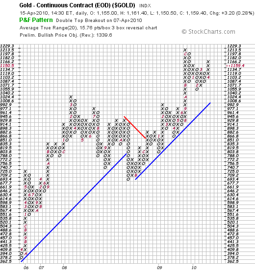
Last week on April 7, 2010 gold saw a double top breakout on the point & figure chart, suggesting a $1339.60 price objective.

Wednesday, March 24, 2010

$GLD - A Coiled Spring

Gold is in the final stages of a large symmetrical triangle. RSI has traded in a range for months. Standard deviation recently made a multi-month low. ADX has been well below 20 for weeks.

Up or down, gold is due for a big breakout.


Sunday, January 24, 2010

$$ Weekly Financials Report

Jan 25-29, 2010
For the annotated chart of $XLF, please go here.

XLF


Price closed down 76 cents for the week at $14.18, slightly below the neutral zone and right above the main trend line on price (~$14.15).

Momentum: RSI closed the week at 38, the floor for up trends. RSI is now as oversold as it has been in 9 months. Watch to see how RSI interacts with 38. A close below 38 signals the up trend is in danger. On the other hand, a positive reversal could develop between the current low and the mid-December low if price/momentum reverses here.

Volume: Heavy short term distribution last week.

Volatility: Average. No squeeze play on.

Last Week's Outlook: Generally bullish. Should price break to new highs, expect resistance at ~$16.50. Price double bottomed at that level in 2002, and $16.50 served as bottom-top resistance in the 2008 downtrend.

Next Week's Outlook: Technically, we are at a crossroads. Watch RSI and price to determine whether this is a test that does not kill the up trend but makes it stronger, or whether the up trend is done for now.

$$ Weekly Tech Report

Jan 25-29, 2010
For the annotated chart of $SMH please go here.


SMH

Price closed at $25.67, down $1.26 on the week. SMH has now corrected 10% over the last 2 weeks. Price violated trend line support (now a dashed line) and closed between the neutral zone and the bottom Keltner Channel (50,4,25).

Momentum: The bearish divergence in late December/early January foretold the correction over the last 2 weeks. RSI dropped to 34, below the floor for up trends. As long as RSI operates below the bear divergence line, we usually expect either downtrend action (lower highs/lower lows) or consolidation. Note that the RSI is more oversold at $25.67 than it was at any prior price low on the chart, providing a glimmer of hope for a new positive reversal in the RSI and a new trend line on price.

Volume: Heavy short term distribution last week.

Volatility: ADX hovered at 21 last week while Std Deviation climbed to its 125-day average. No squeeze play is on.

Last Week's Outlook: We finally got a pull back. Pull backs can be excellent mid-trend entry points. The up trend still looks strong - there is nothing yet to indicate the up trend has changed into a downtrend. Watch to see how price interacts with its trend line as well as potential top-bottom support. In addition, watch how RSI interacts with the floor for up trends (i.e. 38), as well as if a long term positive reversal develops in the RSI.

Next Week's Outlook: Instead of mid-trend entry, the pull back wreaked technical damage, violating the neutral zone, trend line support, and the RSI floor for up trends. The picture is cloudy - wait for clarification.

Tuesday, January 19, 2010

$$ Weekly Energy Report

Jan 19-22, 2010
For annotated charts of $OIH, $UNG and $USO, please go here.

1. OIH


Price closed down $2.63 for the week at $130.19, about halfway between the neutral zone and the outer Keltner Channel (50,4,25). Price recently made a new 15-month high but the breakout failed to ignite. Price remains well above the trend line (~$116).

Momentum: Still watching for any bearish divergence to develop from last week's momentum peak going forward. In addition, looking for any positive reversal to develop. Up trend looks strong.

Volume: Turning towards accumulation after a 2-month breather.

Volatility: We saw the squeeze play work perfectly as price broke out of its consolidation pattern to gain nearly 12% two weeks ago. But now Std Deviation is at a 2-month high, and ADX is at a 9 month high. We may be in for some consolidation as volatility returns to normal.

Last Week's Outlook: Now that OIH has broken out to the upside, the question becomes when to take profits. Watch for bearish divergence between price and momentum when price is at or near the outer Keltner Channel.

Next Week's Outlook: Price could go either way here. Given that the volatility spool appears played out, tighten stops in case of a correction back to the neutral zone.

2. UNG

Price closed down $0.17 for the week at $10.24, but remains in the Keltner (50,1,25) neutral zone. Price has consolidated in a range of $9.78 to $10.96 over the last 22 trading days. Should price start to climb, there is bottom-top resistance at ~$12 (July bottom became a September-October top).

Momentum obeys all the down trend rules (RSI range 62 and below; negative reversals, bull divergence at bottoms). If the bull divergence lines stemming from the old momentum lows are broken to the downside on RSI, the downtrend could accelerate.

Volume: Heavy distribution picture but some short term accumulation last week.

Volatility: With Std Deviation tagging its lower Bollinger Band and ADX under 20 for 2 weeks, the squeeze play is on.

Last Week's Outlook: UNG looks to be consolidating in a range with declining volatility. Be on the alert for a break out. Given the overall picture, any potential break out is likely to be downwards.

Next Week's Outlook: UNG could break out either way soon. Be prepared.

3. USO

Price closed down $2.53 for the week at $38.40, back in the neutral zone. Price is well above the current trend line (~$36), but failed to make a 12-month high last week when it had the chance.

Momentum: RSI corrected hard last week to 45.5. Watch to see if RSI 38 holds - the floor for up trends. Also, watch to see if a short term positive reversal develops in %B compared to the December 21 low (i.e. %B makes a lower low, but price makes a higher low. See dashed lines for an illustration).

Volume: Heavy short term distribution last week.

Volatility: Std Deviation and ADX began to contract last week. No squeeze play.

Last Week's Outlook: With resolution to the upside, we'll see if USO can now push past the $41.50 barrier which has held for 13 months.

Next Week's Outlook: USO failure to beak $41.50 and return to the neutral zone clouds the picture. Watch for a potential positive reversal in %B, and whether RSI 38 holds.

$$ Weekly Stock Report

Jan 19-22, 2010
For annotated charts of $SPY and $QQQQ, please go here.

1. SPY


Price closed down 93 cents for the week at $113.64, well above the main trend line on price (~$109.50). I have drawn a dashed line showing an old positive reversal trend line that was violated in late October, but served as support in December and may serve as support again. Finally, there is top-bottom support at $111.

Momentum: Bearish divergence developed in the RSI last week. Watch whether that bear divergence line serves as resistance. If RSI punches through that line to the upside in the next couple of weeks, the up trend could accelerate. Overall, the up trend looks very strong.

Volume: Rising short and medium term accumulation.

Volatility: SPY spent most of December in a squeeze pattern, with Std Deviation below its long term Bollinger Band (125,1.5) and ADX hovering below 15. After forming a squeeze base, Std Deviation and ADX are now starting to rise which could easily power a nice rally.

Last Week's Outlook: SPY seems to have broken out of its consolidation pattern powered by increased volatility and strong accumulation. I expect SPY to exceed its outer Keltner Channel soon.

Next Week's Outlook: Look to enter on a positive reversal (lower low in momentum but higher low in price) which develops at a support level. Should SPY break to new highs, expect overhead resistance at ~$121.

2. QQQQ


Price closed down 70 cents for the week at $45.85, remains well above the main trend line on price ($43.50). I have drawn a dashed line showing an old positive reversal trend line that was violated in late October but may serve as support. In addition, there is potential top-bottom support at ~$44.50 (in up trends old tops often become future bottoms).

Momentum: Short term bear divergence has appeared on both RSI and %B forecasted last week's correction. Overall, the up trend appears strong. It obeys the up trend range rules (RSI 38+), with positive reversals at corrections and bearish divergence at tops. These are hallmarks of up trends.

Volume: Short, medium and long term accumulation starting to rise.

Volatility is falling after the mid-December breakout, but no squeeze play yet.

Last Week's Outlook: Given the bearish divergence at the outer Keltner Channel, we are due for a pull back soon.

Next Week's Outlook: Look to enter on further pullback to support, especially if a positive reversal develops (momentum makes lower low, price makes higher low).

Monday, January 18, 2010

$$ Weekly Financials Report

Jan 19-22, 2010
For the annotated chart of $XLF, please go here.

XLF


Price closed down 28 cents for the week at $14.94, right on the top border of the neutral zone and well above the main trend line on price (~$14.10). I have drawn a dashed line indicating an old positive reversal trend line on price. While that trend line was violated, it still may serve as support.

Momentum: The picture of a solid uptrend. The RSI has obeyed up trend range rules (38+). We have seen positive reversals at rising bottoms and bearish divergence at tops, both of which are hallmarks of up trends. Finally, we recently saw trend acceleration to the upside when an old bear divergence resistance line was broken.

Volume: Rising short and medium term accumulation.

Volatility: Average. Std Deviation hugs its 125-day average, and ADX has crossed above 20. No squeeze play on.

Last Week's Outlook: XLF seems to have broken out of its consolidation pattern powered by increased volatility, strong accumulation, and trend acceleration after breaking old bear divergence resistance in the RSI. I expect XLF to exceed its outer Keltner Channel soon. If it does, look to take profits when new bearish divergence develops between price and momentum.

Next Week's Outlook: Generally bullish. Should price break to new highs, expect resistance at ~$16.50. Price double bottomed at that level in 2002, and $16.50 served as bottom-top resistance in the 2008 downtrend.

$$ Weekly Tech Report

Jan 19-22, 2010
For the annotated chart of $SMH please go here.


SMH

Price closed at $26.93, down $1.59 on the week and right at its 50-day EMA in the neutral zone. Trend line support is expected at $26.50 next week. Note that there is potential "top-bottom support" at ~$27 and ~$26.50. Top-bottom support simply means that in up trends, corrections (i.e. bottoms) tend to find support at previous tops.

Momentum: The bearish divergence foretold last week's correction. RSI dropped to 44, just 6 points above the floor for downtrends. Note that the RSI is more oversold at the current price of $26.93 than it was when price bottomed the week of December 14 and the week of November 16. In other words, despite greater downward momentum (lower low in the RSI), price has yet to go lower than those prior lows. The uptrend is getting tested. If it survives the test and price reverses back up before making a lower low, this is a bullish development.

Volume: Short and medium term averages show accumulation, while long term average is flattening out.

Volatility: ADX fell from 27 to 21 last week while Std Deviation remained unchanged. Volatility is average. No squeeze play is on.

Last Week's Outlook: Still waiting for a pull back. I would not be surprised to see SMH exceed the outer Keltner Channel before correcting back towards the neutral zone.

Next Week's Outlook: We finally got a pull back. Pull backs can be excellent mid-trend entry points. The up trend still looks strong - there is nothing yet to indicate the up trend has changed into a downtrend. Watch to see how price interacts with its trend line as well as potential top-bottom support. In addition, watch how RSI interacts with the floor for up trends (i.e. 38), as well as if a long term positive reversal develops in the RSI.

Sunday, January 10, 2010

$$ Weekly Metals Report

Jan 11-15, 2010
For annotated charts of $GLD, $SLV and $GDX, please go here.

1. GLD


Price gained $4.06 on the week to close at $111.37, breaking out of the Keltner Channel (50,1,25) neutral zone but well short of the outer Keltner Channel (50,4,25) at $115.73. Trend line support sits at $108 and rising.

Momentum: The mid-December correction obeyed the 38-80+ RSI range rule for up trends. RSI closed Friday at 55.81, about 5 points shy of the bearish divergence resistance line from the late November momentum peak. If RSI can break through this bear divergence resistance, there is a decent chance for an acceleration of the up trend.

Volume: Strong short term accumulation last week with a background of long term accumulation is a sign of trend resumption.

Volatility: Std Deviation fell below its 125-day average last week and then hooked upward. ADX continues to fall from its late November peak, but has yet to cross under 20 and may not do so. No squeeze play, but plenty of volatility up side.

Last Week's Outlook: Positive. I would not be surprised to see GLD resume its up trend soon. Should the trend line on price fail, all bets are off.

Next Week's Outlook: Having resumed its up trend, GLD has some room to run. Watch for resistance on the RSI at the bear divergence line, and on price at the 116-118 level.

2. SLV

Price: SLV gained $1.61 last week (9.7%) to close at $18.15. SLV broke out of the neutral zone, and sits halfway between the neutral zone and the outer Keltner Channel (50,4,25). Upside resistance is expected at the $18.90 - $19.10 level. If broken, the next resistance zone is $20.40-$20.75.

Momentum: The mid-December correction obeyed the 38-80+ RSI range rule for up trends. The bullish divergence between price and %B correctly forecasted an end to the late December correction.

RSI closed the week at 62.14, sneaking above old bearish divergence resistance from the September momentum peak. 62 is also the ceiling for downtrends, and stocks that consolidate often bounce between 38 and 62. Therefore, it will be important to watch if RSI continues to rise above 62, confirming the up trend and the bear divergence break out.

Volume: Exceedingly strong recent accumulation against the backdrop of long term accumulation confirms the bullish picture.

Volatility: We saw a squeeze play develop early last week as Std Deviation dropped to a multi-month low near its lower Bollinger Band (125, 1.5) with ADX ranging between 15 and 20 for the last 2 months.

Last Week's Outlook: SLV does not look as strong as GLD right now. If GLD resumes its uptrend, however, SLV should follow.

Next Week's Outlook: SLV actually outperformed GLD last week. The up trend looks strong. Watch for new bear divergence between price and momentum at or near the outer Keltner Channel for short term profit-taking.


3. GDX

Price closed up $3.63 at $49.84 for a gain of 7.9% last week. Price has barely broken out of the neutral zone, and is about $4.50 shy of both the outer Keltner Channel (50,4,25) and the early December price peak. Trend line support is at ~$46.75.

Momentum: The mid-December correction obeyed the 38-80+ RSI range rule for up trends. RSI closed the week at 58.29, and needs to break 62 to confirm the uptrend. If RSI fails to break 62, GDX is at risk for correction and/or consolidation. Old bear divergence resistance hovers at ~65. If RSI can break through that resistance line, it's all systems go.

Volume: GDX finally had some short term accumulation last week after a month of significant distrubution.

Volatility: GDX developed a squeeze play last week with Std Deviation at a multi-month low near its bottom Bollinger Band (125,1.5) and ADX ranging between 15 and 20 for three months. There appears to be a lot of stored up volatility waiting to pop.

Last Week's Outlook: GDX does not look as strong as GLD right now. If GLD resumes its uptrend, however, GDX should follow unless the general market tanks.

Next Week's Outlook: GDX looks strong and could rise another several dollars in the coming weeks given the pent up volatility and the distance to the outer Keltner Band/prior price peak.

$$ Weekly Energy Report

Jan 11-15, 2010
For annotated charts of $OIH, $UNG and $USO, please go here.

1. OIH


Price broke out of both the neutral zone and the symmetrical triangle consolidation pattern to finish the week up $13.92 at $132.82, slightly above the outer Keltner Channel (50,4,25). Price made new 15-month high and remains well above the trend line (~$115).

Momentum exceeded the RSI 62 level to the upside, confirming the uptrend and closing at a 20 month momentum peak of 74.51. We'll be watching for any bearish divergence to develop from this momentum peak forward.

Volume: Strong short term accumulation last week.

Volatility: Std Deviation crossed its 125-day moving average and ADX has expanded from 13 to 22 in the last week. We saw the squeeze play work perfectly as price broke out of its consolidation pattern to gain nearly 12% last week.

Last Week's Outlook: Wait for the triangle to resolve itself before making any move.

Next Week's Outlook: Now that OIH has broken out to the upside, the question becomes when to take profits. Watch for bearish divergence between price and momentum when price is at or near the outer Keltner Channel.

2. UNG

Price closed up $0.33 for the week at $10.41, but remains in the Keltner (50,1,25) neutral zone. Price has consolidated in a range of $9.94 to $10.96 over the last 17 trading days.

Momentum recently flirted with the RSI 62 boundary for downtrends, and the ceiling held which is bearish. The 45-day average on RSI has climbed to 49.89 which is essentially neutral. Recently, price made a double top between Dec. 28 and Jan. 6, but both RSI and %B made lower highs on Jan. 6 vs. Dec. 28. This is usually bearish. Finally, there is bullish divergence stemming from the early September low. If the bull divergence lines are broken to the downside on RSI, the downtrend could accelerate.

Volume: Heavy distribution picture.

Volatility: Std Deviation is approaching its bottom Bollinger Band (125, 1.5) while ADX crossed below 20 making a 2-month low. We could be entering squeeze play territory.

Last Week's Outlook: Negative.

Next Week's Outlook: UNG looks to be consolidating in a range with declining volatility. Be on the alert for a break out. Given the overall picture, any potential break out is likely to be downwards.

3. USO

Price closed up $1.65 for the week at $40.93. Price is currently halfway between the neutral zone and the outer Keltner Channel (50,4,25). Price is well above the current trend line (~$36), and just 53 cents away from making a 13-month high.

Momentum: RSI broke through the 62 ceiling for downtrends last week, closing at 67.95 and confirming the up trend.

Volume: Heavy short term accumulation picture.

Volatility: Std Deviation finished the week well above its 125-day average, while ADX climbed above 20 last week for the first time in 2 months. No squeeze play, but there is no indication that the volatility explosion is over.

Last Week's Outlook: Consolidation until the symmetrical triangle resolves.

Next Week's Outlook: With resolution to the upside, we'll see if USO can now push past the $41.50 barrier which has held for 13 months.

$$ Weekly Financials Report

Jan 11-15, 2010
For the annotated chart of $XLF, please go here.

XLF


Price closed up $0.82 for the week at $15.22, the highest close since October. Price is just 40 cents shy of the outer Keltner Channel (50,4,25) and well above the main trend line on price (~$14.05).

Momentum: RSI made a 4 month momentum peak at 68 last week. In so doing, RSI finally broke through an old bearish divergence line which was serving as resistance. When it did, price accelerated upwards 5% last week. In addition, RSI broke through the 62 level which is the ceiling for downtrends, thereby confirming the up trend after 2 months of consolidation.

Volume increased this week as evidenced by the skyrocketing short term accumulation average.

Volatility: XLF spent most of December in a squeeze pattern, with Std Deviation below its long term Bollinger Band (125,1.5) and ADX hovering below 20. Price broke out on December 21, traded sideways through the holiday, and spiked up last week. Std Deviation and ADX are now starting to rise which could easily power a nice rally.

Next Week's Outlook: XLF seems to have broken out of its consolidation pattern powered by increased volatility, strong accumulation, and trend acceleration after breaking old bear divergence resistance in the RSI. I expect XLF to exceed its outer Keltner Channel soon. If it does, look to take profits when new bearish divergence develops between price and momentum.

Friday, January 8, 2010

$$ Weekly Stock Report

Jan 11-15, 2010
For annotated charts of $SPY and $QQQQ please go here.

1. SPY


Price closed up $3.13 for the week at $114.57, just 56 cents shy of the outer Keltner Channel (50,4,25) and well above the main trend line on price (~$109). This is the highest weekly and daily close since the current up trend began in March of 2009.

Momentum: RSI made a 3 month momentum peak at 68. There exists some long term bearish divergence on the RSI between the current momentum peak and the September momentum peak. There is some short term bearish divergence between Price and %B. Overall, the up trend looks very strong.

Volume increased this week as evidenced by the rising short term accumulation average.

Volatility: SPY spent most of December in a squeeze pattern, with Std Deviation below its long term Bollinger Band (125,1.5) and ADX hovering below 15. After forming a squeeze base, Std Deviation and ADX are now starting to rise which could easily power a nice rally.

Last Week's Outlook: The consolidation pattern could last awhile. Not a horrible time for entry, although I'd prefer to wait for a pullback. Overall, the picture remains bullish.

Next Week's Outlook: SPY seems to have broken out of its consolidation pattern powered by increased volatility and strong accumulation. I expect SPY to exceed its outer Keltner Channel soon.

2. QQQQ


Price closed up 80 cents for the week at $46.55, a high for the up trend that started in March of 2009. Price continues to hug the outer Keltner Channel (50,4,25), and is well above the main trend line (~$43.25).

Momentum: The up trend is strong. Short term bear divergence has appeared on both RSI and %B which, combined with price at the outer Keltner Channel, could forecast a normal correction coming soon.

Volume shows short term accumulation last week.

Volatility: QQQQ showed classic signs of a squeeze play in the first half of December, with Std Deviation hugging its bottom Bollinger Band (125,1.5), and ADX well below 20. We got a breakout from the low volatility consolidation pattern late during the week of December 14, and QQQQ has gained ~6% since the breakout.

Currently, Std Deviation is above its 125-day average, and ADX has climbed from 14 to 23. Volatility appears average.

Last Week's Outlook: Prudence suggests waiting for a pull back before entry.

Next Week's Outlook: Given the bearish divergence at the outer Keltner Channel, we are due for a pull back soon.

$$ Weekly Tech Report

Jan 11-15, 2010
For the annotated chart of $SMH please go here.


SMH

Price closed at $28.52, up 60 cents on the week, just 30 cents shy of the outer Keltner Channel (50,4,25) and well above the main trend line on price (currently ~$26 and rising).

Momentum: Last week's short term bearish divergence turned into this week's short term positive reversal, as RSI made a lower low compared to last week's RSI low, while price made a higher low compared to last week's price low. Overall, the up trend remains strong having obeyed the RSI up trend range rules for the last 9 months.

Volume: Short and medium term averages show accumulation, while long term average is flattening out.

Volatility: ADX has risen from 15 to 27 over the last month, while Std Deviation hugs its 125 day moving average. Volatility is average. No squeeze play is on.

Last Week's Outlook: The up trend looks strong. Waiting for a pull back.

Next Week's Outlook: Still waiting for a pull back. I would not be surprised to see SMH exceed the outer Keltner Channel before correcting back towards the neutral zone.

Saturday, January 2, 2010

$$ Weekly Tech Report

Jan 4-8, 2010
For the annotated chart of $SMH please go here.


SMH

Price is between the neutral zone and outer upward channel. Price is well above the trend line.

Momentum: The correction ending in early November obeyed the 38-80+ RSI up trend range rule. The RSI 45-day average is nearly 60. Price recently made a 4 month momentum peak, then gave a small bear divergence signal.

Volume: The distribution picture of October and November has turned into an accumulation picture.

Outlook: The up trend looks strong. Waiting for a pull back.

Friday, January 1, 2010

$$ Weekly Energy Report

Jan 4-8, 2010
For annotated charts of $OIH, $UNG and $USO, please go here.

1. OIH

Price remains in the neutral zone. Price made a peak in mid-October, and has since drifted sideways down with lower highs and lower lows. Price remains above the trend line.

Momentum breached the RSI 38 uptrend floor in early December, and has since failed to exceed 62 on the upside. The 45-day average is hovering at 50.90, which is essentially neutral. As best shown on %B, there was a recent negative reversal where momentum made a higher high vs. mid-November, but price made a lower high. This has combined with the positive reversal trend line on price to produce a symmetrical triangle.

Volume: The Accumulation Distribution averages have turned negative.

Outlook: Wait for the triangle to resolve itself before making any move.

2. UNG

Price remains in the neutral zone and near the trend line.

Momentum has recently flirted with the RSI 62 boundary for downtrends, establishing a long term negative reversal (where momentum makes a higher high, but price makes a lower high). The 45-day average on RSI has climbed to 48.56 but is still bearish. Bullish divergence stemming from the early September low. If the bull divergence lines are broken to the downside, the downtrend could accelerate.

Volume: Heavy distribution picture, with the 3-day average bumping up against the 21-day average early last week. In a downtrend, this can provide an excellent shorting opportunity.

Outlook: Negative.

3. USO

Price is barely above the neutral zone and well above the old up trend line. Price looks to be peaking at a new down sloping trend line, forming a symmetrical triangle.

Momentum: RSI breached the 38 floor for up trends, dropping to 30 the second week of December. This created a positive reversal trend line on price vs. the low in late September. More recently, RSI seems to be stalling at 62, the ceiling for downtrends. In so doing, RSI is making a negative reversal compared to the mid-November high, which allows us to draw a down sloping trend line on price.

Volume: Recently, the 21-average has crossed below the 55-average. What had been a picture of accumulation now looks to be one of distribution.

Outlook: Consolidation until the symmetrical triangle resolves.

$$ Weekly Stock Report

Jan 4-8, 2010
For annotated charts of $SPY and $QQQQ, please go here.

1. SPY

Price remains above the neutral zone and above the trend line.

Momentum: The 45-day RSI moving average is well above 50 at 57.89, indicating a strong uptrend despite the fact that RSI has displayed a tight range between 50 and 60 for nearly 2 months. Recently, an old bear divergence line was broken -- often this produces an acceleration of the uptrend but not here. Yet.

Volume: Accumulation/distribution is relatively flat, with the moving averages bunching together. This type of bunching can produce an explosion either way. The 21-day average remains slightly above the 55-day average.

Outlook: The consolidation pattern could last awhile. Not a horrible time for entry, although I'd prefer to wait for a pullback. Overall, the picture remains bullish.

2. QQQQ

Price has stalled at the outer Keltner Channel (50,4,25), and remains well above the trend line. Normally, it's better to enter near the trend line, or near/within the neutral zone.

Momentum: RSI broke through old bear divergence in making a recent 3-month momentum peak, but made new bear divergence in doing so. The 45-day average exceeds 60. RSI has not dipped below 38 for the entirety of the 9 month chart. All of this depicts a strong uptrend.

Volume: Regarding the averages, 3 > 21 >55 which suggests a healthy uptrend, but not usually the correct time to enter.

Outlook: Prudence suggests waiting for a pullback before entry.

$$ Weekly Metals Report

Jan 4-8, 2010
For annotated charts of $GLD, $SLV and $GDX, please go here.

1. GLD


Price has retreated into the Keltner (50,1,25) neutral zone from the peak in early December. The neutral zone can be an excellent entry opportunity depending on the momentum and volume pictures.

Momentum: The recent correction obeyed the 38-80+ RSI range rule for uptrends. The 45-day RSI moving average remains well above 50 which is bullish. The early December peak provided bearish divergence which portended the recent correction. If the correction does not kill the uptrend, the bear divergence can make the uptrend stronger. Finally, the correction has provided an intermediate term positive reversal in the RSI, where momentum made a lower low vs. late October, but price could not make a lower low. As a result, we draw a new trend line on price connecting these important lows.

Volume: There has been recent short term distribution in a picture of long term accumulation. The 21-day average is well above the 55-day average. The 55-day average is sloping up nicely. And the 3-day moving average has fallen below the 21-day average. This type of set up usually provides an excellent mid-trend entry point, especially when combined with a positive reversal in the RSI.

Outlook: Positive. I would not be surprised to see GLD resume its uptrend soon. Should the trend line on price fail, all bets are off.

2. SLV

Price has slipped below the neutral zone, just barely.

Momentum: The recent correction obeyed the 38-80+ RSI range rule for uptrends. The 45-day RSI moving average is hovering at 50.24 which is essentially neutral. The RSI shows bearish divergence which portended the recent correction. If the correction does not kill the uptrend, the bear divergence can make the uptrend stronger. The correction has not provided a positive reversal in the RSI. There is, however, some bullish divergence between price and %B which could forecast an end to the recent correction.

Volume: There has been recent short term distribution in a picture of long term accumulation.

Outlook: SLV does not look as strong as GLD right now. If GLD resumes its uptrend, however, SLV should follow.

3. GDX

Price remains in the neutral zone.

Momentum: The recent correction obeyed the 38-80+ RSI range rule for uptrends. The 45-day RSI moving average is hovering at 50.30 which is essentially neutral. The RSI shows bearish divergence which portended the recent correction. If the correction does not kill the uptrend, the bear divergence can make the uptrend stronger. The correction has not provided a positive reversal in the RSI.

Volume: There has been significant short term distribution in a picture of long term accumulation.

Outlook: GDX does not look as strong as GLD right now. If GLD resumes its uptrend, however, GDX should follow unless the general market tanks.