Kind Words from Terry Laundry, Founder of T Theory

"Parker has sent me what I consider to be the most important refinements to T Theory I have ever received from anyone in an e-mail . . . which he calls Tweaking the 13th Advance Decline T." September 29, 2010

"Parker has sent me a very interesting concept which is the NY Advance Decline line divided by the put-call ratio . . . What he's done is introduce the idea of sentiment." September 15, 2010

"Parker discovered the Money Flow Ts . . . This is something like the Holy Grail in T Theory. You are always looking for something that will help you refine the peak date." October 17, 201

"Money Flow Ts are probably the greatest new thing I have seen in 20 years in terms of time symmetries."
December 5, 2010.

Wednesday, August 18, 2010

$$ Kyle Bass Tells It Like It Is - Part Two

Bass' Best Investment Ideas - CNBC.com

$$ Kyle Bass Tells It Like It Is - Part One

Ahead of the Money - CNBC.com

$$ Yesterday's News: China Sells. Today's News: Fed Buys.

Interesting headlines coming one day apart:

China Reduces Long-Term Treasuries by Record Amount

Fed Buys $2.551B Treasuries

Monday, August 16, 2010

$$ ARMS warning

I closed out of my shorts today based on the 5-day ARMS showing a deeply oversold condition combined with today's price action and a short term head & shoulders topping pattern on the VIX. 

Note the recent rallies after previous similar oversold ARMS warnings.  If we get a rally, I'll put my short back on because I am generally bearish on the market through October. 

Monday, August 9, 2010

$$ QE 2.0?

The FOMC meets on Tuesday.  Speculation persists that the Fed will announce a new round of quantitative easing at the meeting.  Ambrose Evans-Pritchard examines the topic in today's London Telegraph.  He concludes:

"Alabama Senator Richard Shelby has blocked the appointment of MIT professor Peter Diamond to the Fed Board, ostensibly because he is a labour expert rather than a monetary economist but in reality because he is a dove in the ever-more bitter and polarised dispute over QE.

The Senate has delayed confirmation of all three appointees for the board, who all happen to be doves and allies of Fed chairman Ben Bernanke. The Fed is in limbo until mid-September. So the regional [Fed chief] hawks who so much misjudged matters in 2008 [when the Fed only managed one 25 basis point Fed funds rate cut as America burned between March 19 and October 7, 2008] have unusual voting weight, and now they have a commodity spike as well to rationalise their Calvinist preferences.

Whatever Dr. Bernanke wants to do this week - and I suspect he is eyeing the $5 trillion button lovingly - he cannot risk dissent from three Fed chiefs: one yes, two maybe, but not three. He faces a populist revolt from the Tea Party movement, with its adherents in Congress and the commentariat. And China simply hates QE, which may or may not be rational but cannot be ignored.

Global markets have already priced in the next QE bail-out, banking the "Bernanke Put" as if it were a done deal. We will find out on Tuesday if life is really that simple."

Friday, August 6, 2010

$$ Hindenburg Omen

The Hindenburg Omen is traditionally defined when, on a given day, the number of NYSE new 52 week highs and new 52 week lows must both exceed 2.2 percent of total NYSE issues traded that day.  The Omen is a bearish sign.  Robert McHugh has studied the Omen in depth, and finds several other conditions helpful in predicting a downturn in the stock market:

1)  The NYSE 10-week moving average is rising the week of the Omen,
2)  The McClellan Oscillator is negative on that same day, and
3)  The number of new 52 week highs cannot exceed twice the number of new 52 week lows that day.

Omens often come in clusters.  The first time an Omen occurs, it's called an unconfirmed Omen. If a second Omen occurs within 36 days of the first Omen, the Omen is "Confirmed." 

McHugh's study has shown that Confirmed Omens have preceded all stock market crashes and panics over the last 25 years.  In addition, 75% of the time the market falls at least 5% after a Confirmed Omen.  These downturns have commenced within 1 day to 4 months after the confirmation of the Omen. 

From the up trend that started in March of 2009, we received our first Hindenburg Omen on Tuesday, July 6, 2010.  We'll be on the lookout for confirmation.  Today came close, but no cigar.  

Thursday, August 5, 2010

$$ Option Strategies to Take Advantage of Price & Volatility Movements

Option prices are primarily determined by:

1.  Whether and how much the option is in the money (i.e. intrinsic value), and

2.  The time value of the option.

Time value is a function of several things.  One of the main drivers is volatility.  The greater the volatility, the higher the time value component of the option price, all other things being equal.   Volatility generally rises when prices drop, and falls when prices rise. 

During up trends, you might think that buying call options on price dips makes sense.  However, this strategy has a couple of problems:

1.  After a price dip, volatility will be relatively high.  So, you are paying a huge premium for the time value of the option.

2.  If you are right and the price of the underlying moves upward, your reward is sabotaged by falling volatility, i.e. falling time value of the option.  

Accordingly, I prefer to sell puts on dips in up trends.  This is a "premium collection" strategy.  My gain is limited to the amount of premium I collect. 

By selling puts when volatility is high, my premium is increased (because the time value component of the option price is increased).  If the up trend resumes as I expect and price moves upward (and volatility falls), then:

1.  The puts I sold become further out of the money, and

2.  The time value component of the puts I sold falls. 

Both of these things are good for me.  I want the puts I sold to expire worthless to the put buyer. 

IMO, selling puts on dips in uptrends is a far superior strategy to buying calls on dips in uptrends because with selling puts, I benefit from both price and volatility movement.  I prefer selling puts that are slightly out of the money with an expiration date 2-3 months out.  During a multi-year up trend, I hope to have ~3 opportunities to sell puts per year.   

In downtrends, on the other hand, buying puts on rallies takes advantage of both price and volatility movement.  After a rally, volatility will be relatively low.  Should prices resume their decline, volatility will rise.  All option buyers benefit from rising volatility.  And puts benefit from falling prices. 

IMO the best way to capture the benefits of falling prices and rising volatility is to purchase longer term (6 months to a year) out of the money puts.  You want some time left on your puts after the expected price decline occurs.  This way, you maximize the benefit of the volatility increase. 

Options are a complicated subject.  The foregoing is an oversimplified treatment, but the concepts are sound.

$SPY Market Breadth - Percent Above 50 DMA, 150 DMA

Let's take a look at a couple of charts showing the percent of S&P stocks above their 50 day moving averages, and 150 day moving averages.  First the 50 day chart:


You'll notice that we rarely drop much below the 20-25% range unless we are starting a new downtrend.  The May-June drop well below 20% is ominous in this regard.  It is my belief that we have begun a new downtrend.

In addition, you'll note that during downtrends, rallies don't make it past the 75-80% resistance zone.  Currently, we are sitting at 73%.  Based on this reading of the chart, we are very near a top.

Here's the 150 day chart:


Similarly, you'll note that breaks below the 35-40% range usually signify downtrends, while breaks above 60-65% are characteristic of up trends.   Up trends tend to find support at the 60-65% and 35-40% range, while downtrends find resistance at the 60-65% range.

Recently, we broke well below 35%  on the 150 day, and currently we are at 57%, both of which confirm the interpretation of the 50 day chart that we are near a top in a new downtrend.

If we manage to break through the resistance zones for downtrends (75-80% on the 50 day, 60-65% on the 150 day), the "new downtrend" will be placed in serious doubt.

Wednesday, July 28, 2010

$$ Arch Crawford & The Cardinal Climax

Arch Crawford attempts to time the markets using astrology.  The Hulbert Financial Digest follows his newsletter, and Hulbert rates it highly at times.

Crawford sees turmoil around the corner in the stars.  On Sunday, August 1 he projects a Cardinal Cross.  Here's how he described it in his January 2010 newsletter:

"[There is] a high probability that World Markets will Crash again during 2010. The point of greatest exactitude of the general ‘meanness’ will show itself in late July and early August. During that period Mars will conjoin Saturn, both opposing Jupiter conjoining Uranus (you can joke all you want, but THIS is no laughing matter). Pluto will form a square angle to all four, making a T-Square pattern of extreme animosity. . . .

We will do everything but guarantee you that stocks will crash worldwide within three months of August first (that is between May 1 and November 1). It is expected that technical market analysis of data generated by current market action will assist in pinpointing most danger/opportunity as critical moments approach."

Crawford notes that, following the Cardinal Cross on August 1, there will be a Full Moon on the Fall Equinox (September 22, 2010) and a Total Lunar Eclipse on the Winter Solstice (December 21, 2010), both exceedingly rare events.  He says "We expect the depth and scope of dislocations during this period to exceed anything we have ever witnessed."

Here's an article on Seeking Alpha and an article on Market Watch with more information.  

$$ Gold's 65 Week Moving Average and Gann

Since 2001, Gold has not spent any serious time under its 65-week moving average except for about 4 months in latter 2008.  Generally, Gold finds support at its 65-week moving average.  Accordingly, a retreat to the 65-week moving average is usually a great time to buy Gold. 

This week, Gold's 65-week moving average currently sits at $1080.03 and is rising about $5 per week. In addition, my Gann Square of 9 shows an important inflection point at $1088.50 which can also serve as the basis of support. 

We are currently experiencing a correction in Gold from the peak of $1265 in June.  Gold traded as low as $1159.50 today.  If $1132.25 (another Gann inflection point) does not hold, look for Gold to test its 65-week moving average at or near $1088.50.  Should Gold find support there, I will likely initiate a long position.

$SPX - Gann Inflection Points

The next Gann inflection point on the S&P is 1144.25 +/- 1.5 points.  I derived this from my personal Gann Square of 9 calculator.  Should the S&P experience significant resistance at this level, I will likely initiate a short trade. 


On the Dow, the next Gann inflection point is 10,732.50 +/- 15 points.  For the NASDAQ composite, the next Gann inflection point is 2353 +/- 4.5 points. 

Note, should price break through these inflection points with little resistance, then these inflection points can serve as support levels on any subsequent correction, and can be excellent long entry points if they do provide support.

Friday, June 11, 2010

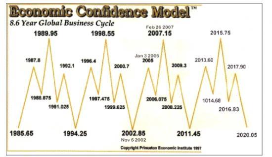
$$ Martin Armstrong's Economic Confidence Cycle

On Monday, June 13, 2011 (2011.45), one year from tomorrow, Martin Armstrong's economic confidence model predicts an 8.6 year cycle low in economic confidence:


If Armstrong is right, in all likelihood risk appetite will be very low a year from now, and safe haven assets will experience a peak.

Note that Terry Laundry's Confidence Index experienced an important low in 2002, and an important high in 2007.  Not exactly the same dates that Martin Armstrong projected in 2002 and 2007, but close.

Note also that the Aden Sisters 8 & 11 year gold cycle chart projects an 11 year cycle high in gold in ~2011-12, an 8 year cycle low in ~2015-16, and another 11 year cycle high in ~2019-2020.  These dates generally line up with Armstrong's calls for tops and bottoms in economic confidence over the next decade.

Friday, June 4, 2010

$GLD - Potential Cup and Handle Formation

There is a potential cup & handle pattern forming in gold.  William O'Neil discovered the pattern.  Some of the things he looks for in cup & handle patterns are:

1.  Share price rise leading into left lip at least 30%.  Here the rise was 34% from July 2009 to December 2009.

2.  Cup duration usually between 13 and 26 weeks.  This cup formed over 22 weeks.

3.  Cup depth between 12-33%.  The depth here is 18%.

4.  Declining volume in the handle.  Check.

5.  The handle forms in the upper half of the cup above the 200-day moving average.  Check.


6.  Handle duration best if completes within 4-5 weeks.  So far so good.

In addition, I like to see U-shaped volume in the cup formation, which we have here.

The pattern is confirmed when price closes above the right lip of the cup on a significant volume breakout.  If the pattern completes, the conservative target is half the depth of the cup above the right lip, or $1345. Many times, price will exceed full cup depth added to the right lip, or $1445 in this case. 


We are nearing a low risk entry point for gold.  Gold closed down today at $1206.80.  Should it fall back into the $1185 region over the next week or so, you could enter long with a stop at $1130 (50% of the cup depth).  You'd be risking $55 for a potential gain of $160 to $260.

Monday, May 31, 2010

$SPY - Head & Shoulders Pattern Forming?

As indicated in the chart below, the put-call ratio is overly bearish which sets up nicely for a rally in the S&P.  In addition, several other indicators show that we might be due for a rally.


If we get a rally over the next several weeks, I'll be watching how the S&P interacts with the 1150-1170 levels of former support and resistance, as well as the 50-day moving average (currently at 1163).  Should the S&P fail to break through these levels and start to retreat, it will form the right shoulder of a head and shoulders topping pattern, which would be immensely bearish.

If it forms, this right shoulder should complete well ahead of Terry Laundry's August 26 projected top date.

Wednesday, May 19, 2010

$$ Huge Spike in the Put/Call Ratio

The combined equity-index put/call ratio spiked to over 4:1 at the open.  Readings over 1:1 are considered extreme fear.  Looking at long-only day trading set ups today.

Monday, May 17, 2010

$SLV Put-Call Ratio Update

Last Wednesday, I wrote about about the Put-Call ratio in SLV reaching a one-year low.  I mentioned you might want to start planning your exit strategy if you were long.  The next day, silver hit a yearly high of $19.80 an ounce on Thursday, May 13. 

This morning, silver is now trading at less than $18.80 an ounce, a fall of more than $1.00 an ounce since last Thursday:


Why does this happen?  Once you get full participation on the bull side, there's a ton of sell stop orders sitting beneath the market price.  Many of them are market orders.  Once they start to get triggered, it can become a cascade of selling action.

$$ Fed Funds Target Rate & AAII Stock Screens

Every few years, the Federal Reserve changes direction on its Fed Funds target rate.  I classify a change of direction as a 50 basis point move.  It usually happens over two 25 basis point moves, but occasionally the Fed will move 50 basis points all at once.  Here's the history over the last ~15 years:

December 19, 1995:  Target rate coming down. 
August 24, 1999:  Target rate going up. 
January 31, 2001:  Target rate coming down. 
August 10, 2004:  Target rate going up. 
September 18, 2007:  Target rate coming down. 

The American Association of Individual Investors (AAII) has tracked the performance of a variety of stock screens since 1998.  Theorizing that some companies and therefore AAII screens do better in times of cheap money, while other companies/AAII screens outperform in times of money tightening, I wondered whether the change of direction in the Fed Funds target rate could be a useful signal in choosing between the AAII stock screens over the last 13 years.  

AAII member Todd (screen name "tschoepflin") came to the rescue.  What he found was quite remarkable:  using the Piotroski 9 screen during periods when the Fed Funds target rate was coming down, and switching to the Kirkpatrick Value screen once the Fed Funds target rate started to climb produced annualized compound returns in excess of 48% from 1998-2009!  And you'd be up another 158% from January 1, 2010 through April 30 2010! 

Switching between Piotroski 9 and Kirkpatrick Value significantly outperformed sticking to one screen or the other exclusively.  From 1998-2009, Piotroski 9 returned ~28% a year (one of the top 4 performing screens), while Kirkpatrick Value returned ~19% per annum.  Further, during periods of money tightening, Piotroski 9 returned only 15.7% cumulative from September 1, 1999 - January 31, 2001, and lost money between September 1, 2004 and September 30, 2007.  During periods of money easing, Kirkpatrick Value essentially broke even between February 1, 2001 and August 31, 2004, and has lost money since October 1, 2007.

This performance was measured using AAII's methodology, which is a monthly re-balancing model with 100% re-invested in all passing companies each month.  If only one company passed the screen, you'd be 100% allocated in that one stock for the month.  If no companies passed the screen, you'd sit the month out.  No stop loss orders are used.   

To use the Fed Funds target rate change of direction as a signal, you would simply switch screens the month after a Fed Funds target rate change of direction.  Here's the yearly performance breakdown, with the S&P cited for comparison:

1998
Piotroski 9:  17.9%
S&P:   26.7%

1999
Piotroski 9/KV:  26.6%
S&P:  19.5%

2000
Kirkpatrick Value:  63.9%
S&P:  (10.1%)

2001
KV/Piotroski 9:  48.3%
S&P:  (13.0%)

2002
Piotroski 9:  (15.9%)
S&P:  (23.4%)

2003
Piotroski 9:  154.6%
S&P:  26.4%


2004
Piotroski 9/KV:  91.3%
S&P:  9.0%

2005
Kirkpatrick Value:  88.2%
S&P:  3.0%

2006
Kirkpatrick Value:  18.5%
S&P:  13.6%

2007
KV/Piotroski 9:  44.2%
S&P:  3.5%

2008
Piotroski 9:  32.6%
S&P:  (38.5%)

2009
Piotroski 9:  78.3%
S&P:  23.5%

2010 ending 4/30/10
Piotroski 9:  158.3%
S&P:  6.4%

Switching between Piotroski 9 and Kirkpatrick Value using the Fed Fund target rate change of direction as a signal beat the S&P every year except 1998, and most years it crushed the S&P by a net of at least 40%.  The S&P returned a compounded ~1% from 1998-2009.  Also, Piotroksi 9/KV only had one losing year  in thirteen (2002). 

With taxes, slippage and transaction costs, it's impossible to duplicate these results in the real world.  Especially in some of the thinly traded stocks that pass through these screens.  But thanks to Todd for giving us something the chew on if the Fed ever decides to raise the target rate again.

Saturday, May 15, 2010

$$ IOUs? We don't need no stinking IOUs!

Unlike California, Illinois is not issuing IOUs.  They're simply refusing to pay their bills:

Right now, $4.4 billion worth of bills, some dating back to October, are sitting in the Illinois comptroller's office waiting to be paid someday. . . . Illinois is on track to end the current fiscal year with about $6 billion in unpaid bills. Budget proposals for the coming year — when the state faces a $13 billion deficit — assume the same thing will happen again.

As you might imagine, this is wreaking havoc on companies that do business with Illinois.  For more details on this sorry "state" of affairs, see IllinoisIsBroke.com. 

$$ More Put/Call Ratio

Expanding our view from individual stocks/ETFs discussed earlier, the CBOE tracks three broad-based put/call ratios throughout the day which are best applied to the action in the Dow and S&P:  

1.  The Equity PC ratio;
2.  The Index PC ratio, and 
3.  The Combined PC ratio.  

The Equity PC ratio is generally much lower than the Index PC ratio, as the Equity reflects a retail investor crowd with a tendency to favor longs (more calls), while the Index PC ratio reflects the institutional investor crowd with a greater interest in hedging (more puts). 

The Combined PC ratio gives the trader the best gauge of what the overall market is thinking.  Of the three, this is the ratio I watch.

In his excellent book Mastering the Trade, John Carter writes that if the Combined PC ratio falls below 0.6 intraday, he will ignore all long set ups and start looking at short set ups.  He explains that below 0.6 represents extreme bullishness with near full participation from the long side.  In other words, there's:

1.  Very few left to buy, and
2.  Lots of sell stops sitting beneath the current price, just waiting to be hit.

Conversely, if the Combined PC ratio rises above 1.0 intraday, Carter will ignore all short set ups and start looking at long set ups.  He explains that above 1.0 represents extreme bearishness with near full participation from the bear side.  There are many buy stops sitting above the current price, just waiting to be taken out.

On Stockcharts.com, the symbol for the Combined PC ratio is $CPC.  Via subscription, it can be tracked real-time intraday.  Let's take a look at a 30-minute chart over the last month, with the S&P charted below it by comparison:


As you can see, tracking the Combined PC ratio would have alerted you to the extreme greed at  the yearly market highs in late April, extreme fear after the May 6 correction, as well as the gyrations between greed and fear late last week.  

We'll see if ~1130 turns out to be a swing low, or if the market continues to slide some more before turning around.  One thing is certain, the odds are against you trying to build a short position here with a Combined PC ratio of 1.11.  You should have been looking at long set ups on Friday.

Thursday, May 13, 2010

$$ David Rosenberg Projects Gold to Peak at $3000+/ounce

David Rosenberg was Chief Economist at Merrill Lynch before moving back home to Canada a year ago.  He now works for Gluskin-Sheff and writes a near-daily economic report called "Breakfast with Dave."  I highly recommend it.  It's the best source of macro-economic news I have seen.  You can subscribe by e-mail for free.  Click on the link above to learn how.  

Mr. Rosenberg penned the following on May 12, 2010:

"GOLD GLITTERS

In the aftermath of the Lehman collapse, gold faltered as there was a huge margin call everywhere and investors seeking liquidity sold off their winners. The secular bull market for bullion did not end at the time, no long-term trendline was violated, and gold did rise in non-U.S. dollars and far outperformed other currencies.

But what happened during this recent round of intense European-led volatility and financial market weakness was that gold rallied even in U.S. dollar terms, which is significant seeing as there were large-scale safe-haven inflows into greenbacks. So this time, gold has managed to hit new highs in all currencies, and gold rallied even with the overall commodity complex slipping noticeably over the past few weeks.

This is a sign. Of what, you may ask? That gold is no longer trading just as part of the resource sector but is now taking on the characteristics of a currency. While the U.S. dollar has gained ground since late last year, there is no doubt that an Administration that has a stated policy of doubling exports in the next five years to “support” two million jobs absolutely craves a depreciating greenback.

Meanwhile, a new socialist government in Japan wants a weaker yen. Sterling has only one way to go in an environment of heightened political uncertainty and a balance sheet that is at least as extended as Greece. And the ECB just gave notice with its agreement to buy sovereign and corporate debt that it is willing to distort the pricing of risk in the bond market for the greater good of helping profligate countries to avoid either defaulting or certainly help them finance their obligations at a subsidized cost. The Bundesbank, this is not.

So gold is no government’s liability and the shape and shift in its supply curve is the shape would seem to be a little easier to make out than fiat currency. We may end up being overly conservative on our peak gold price forecast of $3,000 an ounce."